


-
- 로그인후 이용해주세요.
질문과 답변
2024.11.29 16:36
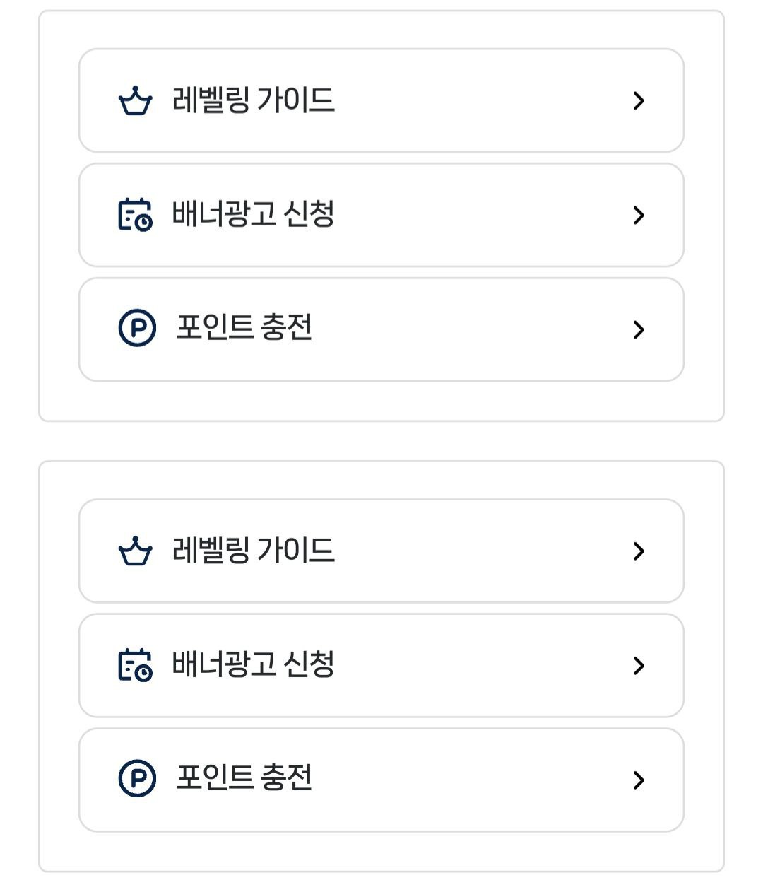
복사한 위젯과 기존 위젯 분리 적용 방법

1. 기존 rb.quick_btns
2. 버튼 좌우 배열을 위해 위젯 폴더명 rb.quick_btns2 변경 후 코드 수정
3. rb.quick_btns2에 적용된 좌우배열 코드가 기존 rb.quick_btns에도 영향을 줍니다.
위젯 이름만 달리 하면 디자인도 별도로 적용되는 줄 알았는데 아닌듯 합니다. 기존 위젯과 수정 적용 할 위젯 각각 적용 하는 방법 질문드립니다.
<!--
경로 : /rb/rb.widget/rb.quick_btns/
사용자코드를 입력하세요.
-->
<div class="q_btns_container">
<!-- 좌측 버튼 그룹 -->
<div class="q_btns pc">
<button type="button" class="arr_bg" onclick="location.href='#';">
<span>레벨링1 가이드</span>
</button>
<button type="button" class="arr_bg" onclick="location.href='#';">
<span>배너광고 신청</span>
</button>
<button type="button" class="arr_bg" onclick="location.href='#';">
<span>포인트 충전</span>
</button>
</div>
<!-- 우측 버튼 그룹 -->
<div class="q_btns pc">
<button type="button" class="arr_bg" onclick="location.href='#';">
<span>레벨링1 가이드</span>
</button>
<button type="button" class="arr_bg" onclick="location.href='#';">
<span>배너광고 신청</span>
</button>
<button type="button" class="arr_bg" onclick="location.href='#';">
<span>포인트 충전</span>
</button>
</div>
</div>
<style>
.q_btns_container {
display: flex;
gap: 10px; /* 모든 간격 10px로 통일 */
justify-content: center;
max-width: 800px;
margin: 0 auto;
padding: 10px; /* 컨테이너 여백 10px */
}
.q_btns {
flex: 1; /* 좌우 균등 분할 */
display: flex;
flex-direction: column;
gap: 10px; /* 버튼 간 간격 10px */
}
.arr_bg {
width: 100%;
padding: 10px; /* 버튼 내부 여백 10px */
border: 1px solid #ddd;
border-radius: 10px;
background: #fff;
cursor: pointer;
transition: all 0.3s ease;
text-align: center;
}
@media (max-width: 768px) {
.q_btns_container {
flex-wrap: wrap;
gap: 10px;
justify-content: space-between;
}
.q_btns {
width: calc(50% - 5px); /* 정확한 50% 너비 계산 (간격 고려) */
flex: 0 0 auto; /* 크기 고정 */
}
.arr_bg {
width: 100%;
justify-content: center;
}
}
</style>
<script>
function openNewWindow(url) {
var width = Math.min(window.screen.width, 1380);
var height = Math.min(window.screen.height, 768);
var left = (window.screen.width - width) / 2;
var top = (window.screen.height - height) / 2;
window.open(url, '_blank', `width=${width},height=${height},left=${left},top=${top},resizable=yes,scrollbars=yes`);
}
</script>
- 이전글유튜브 쇼츠 게시판은 개발중이나요? 업데이트 중이나요?2024.11.30
- 다음글박스 크기 문의 합니다2024.11.29
댓글목록

